NL Properties
Building relationships that last a lifetime
Introduction
NL Properties Company is specialized in managing real estate and properties owned by individuals, companies and commercial complexes. NL Proprieties’s strategy is to build a relationship with its clients that is based on mutual trust.
Challenge
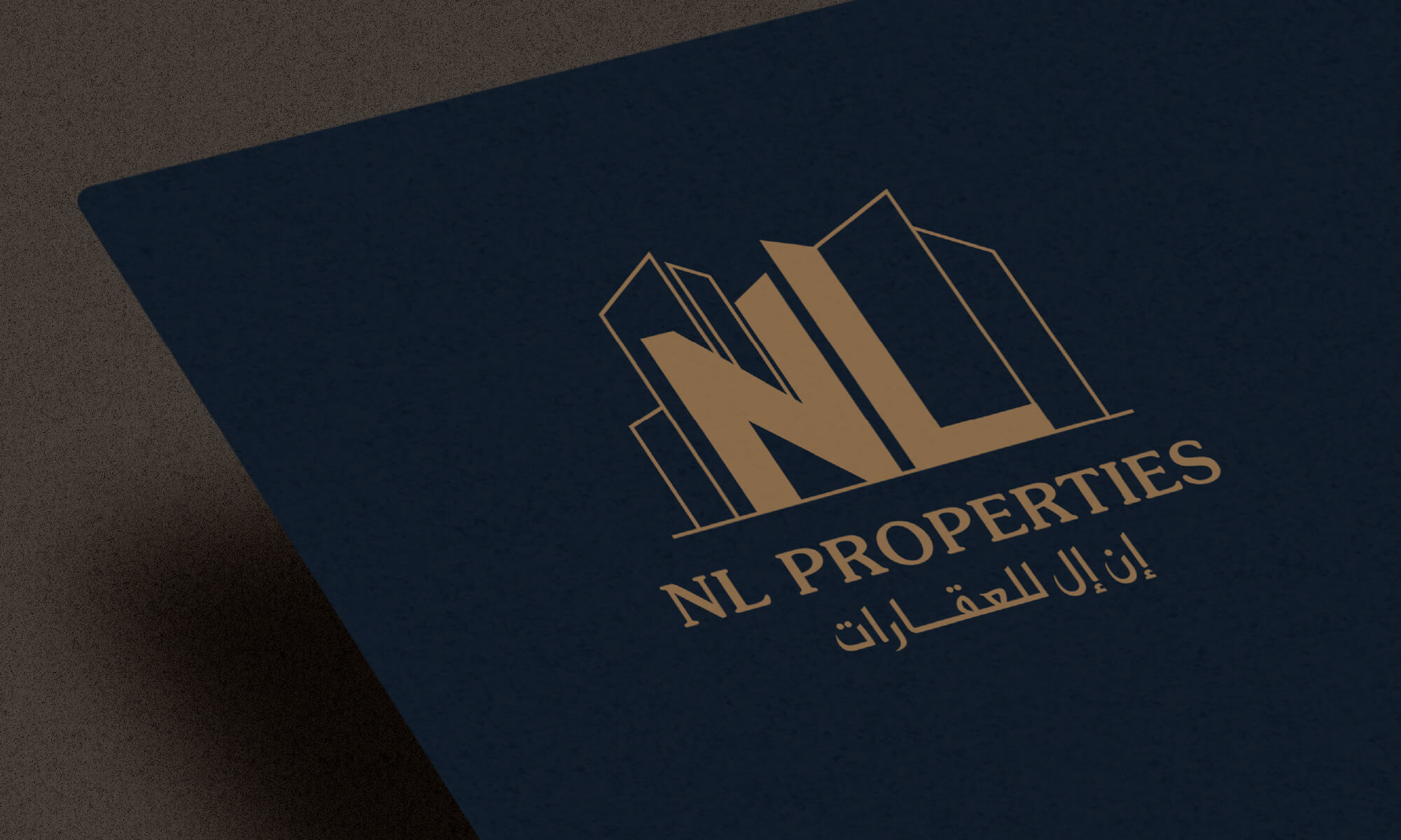
Muharraqi Design was given the task to reflect NL Properties identity and principles in the visual identity design. In addition to communicating quality, trust and speed values to the targeted audience.
Solution
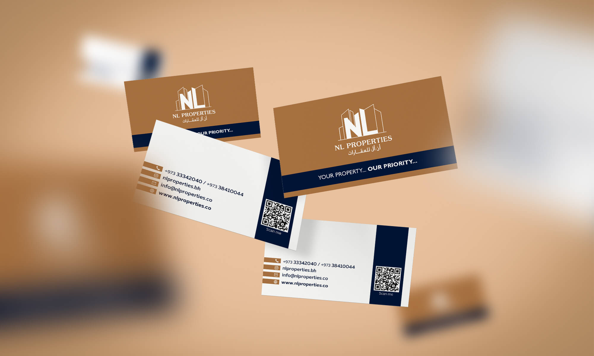
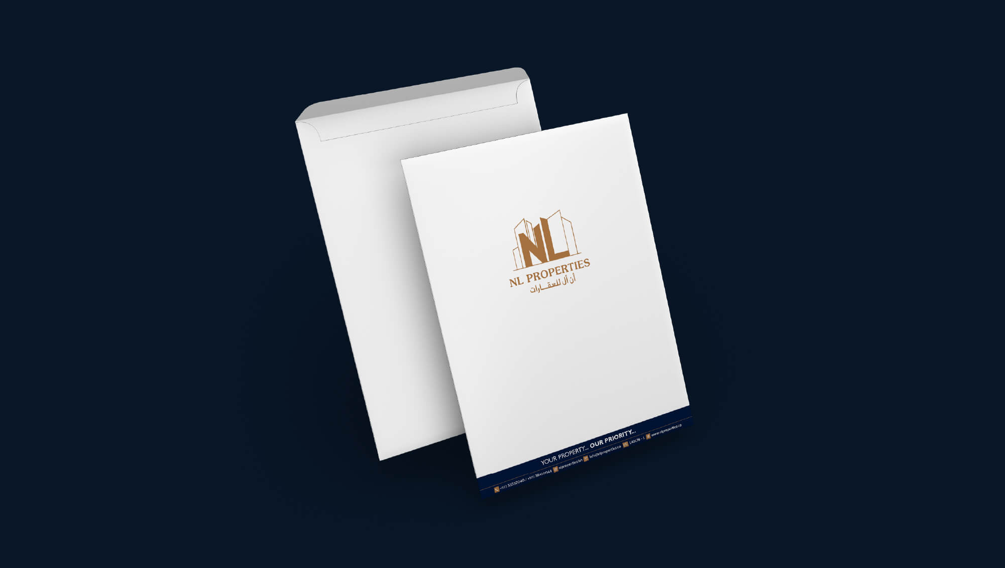
The team has done an in-depth research of the real estate local market in order to decide upon the design direction that works in favor of NL Properties. After examination of different logo types, letter mark logo have been used in designing NL Proprieties visual identity as it is easy to use for the company’s different applications. As regard to the identity’s colors, the gold color have been used to reflect success and wealth in addition to the blue color to reflect professionalism and trust.
Results
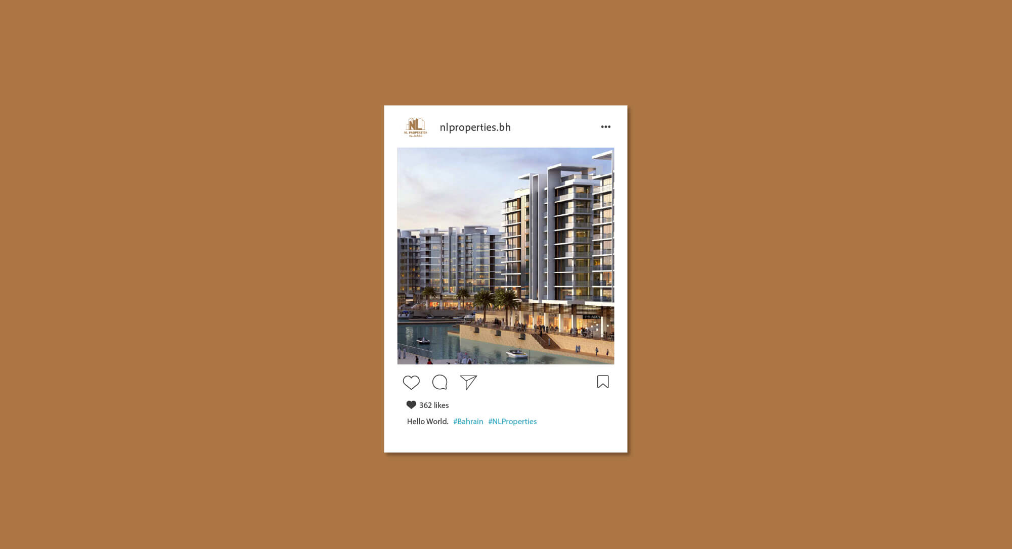
NL Properties have succeed in positioning itself correctly in the market as it have succeed in establishing many prestigious projects like The Harbour Row, GFH Harbour Heights and Juffair Square. Also, NL Properties have collaborated with clients from different sectors.
